Kitchen Colour Schemes & Finishes
Kitchen Colour Schemes & Finishes: A Complete Guide
Last updated: January 2026
Choosing the right kitchen colour scheme can transform one of the most important rooms in your home — not just visually, but in how it feels to live in. A well-considered kitchen colour palette makes your kitchen look cohesive, enhances the sense of space, and expresses your personal style. Whether you prefer timeless neutrals, striking accents or warming earthy tones, understanding how colour works in a kitchen will help you make confident decisions that last.
Here, we’ll explore modern kitchen colour schemes that work beautifully in UK homes in 2026, how to match colours with your layout and lighting, and practical tips for combining colours successfully. This guide is ideal if you’re planning a new kitchen, refreshing an existing space, or comparing colour options before committing to cabinetry. Let’s dive in.
What Are Kitchen Colour Schemes & Finishes?
A kitchen colour scheme is the combination of cabinet colours, finishes, materials and accents used to create a cohesive and balanced look. When paired with the right finish — such as matt, gloss or textured surfaces — colour influences how spacious, bright and timeless a kitchen feels.
Colours influence mood, perceived size, lighting effects and overall ambience — so choosing a thoughtful palette is as important as choosing materials or fixtures.
Kitchen colour schemes can be:
- Classic neutrals that stand the test of time
- Bold and vibrant accents for personality
- Soft pastels for light, airy feels
- Monochrome palettes for sleek, modern kitchens
Top Kitchen Colour Scheme Categories
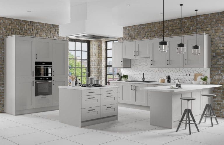
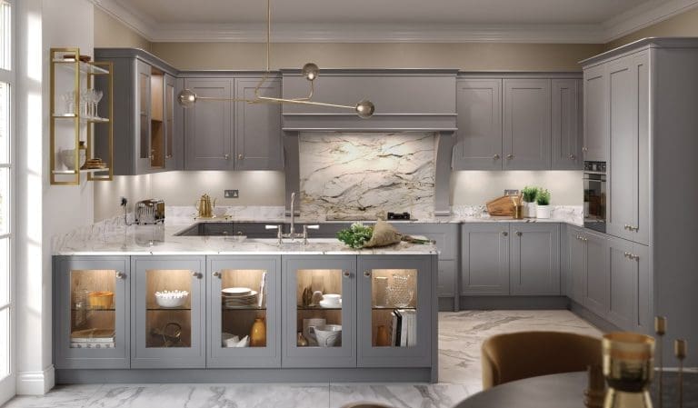
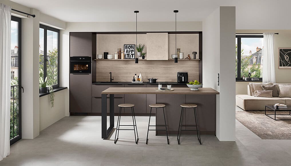
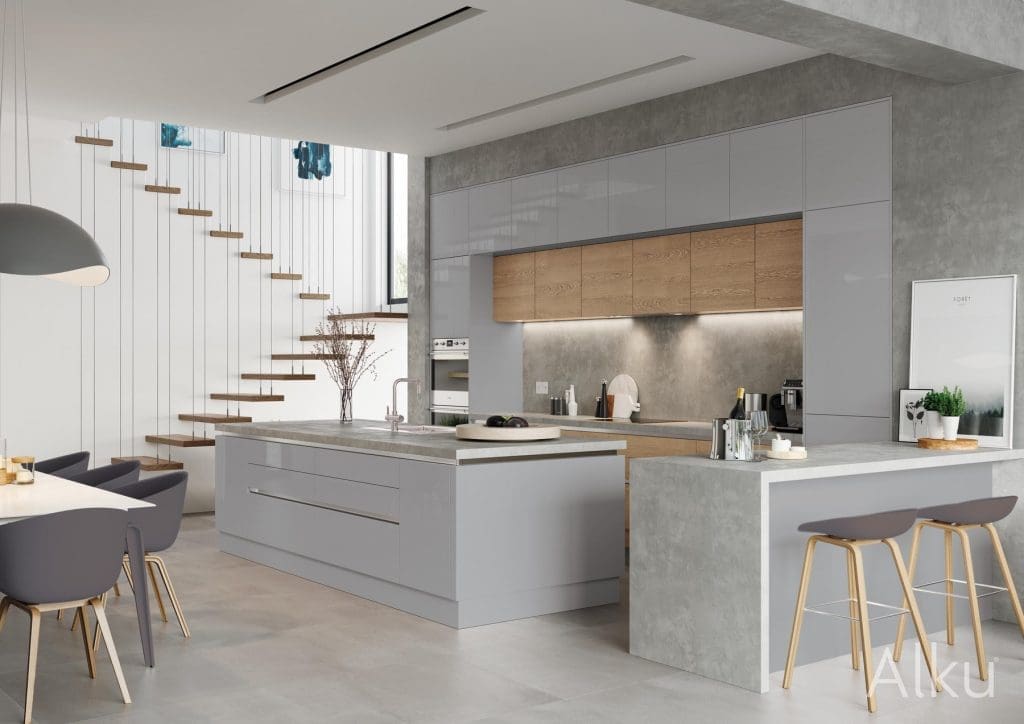
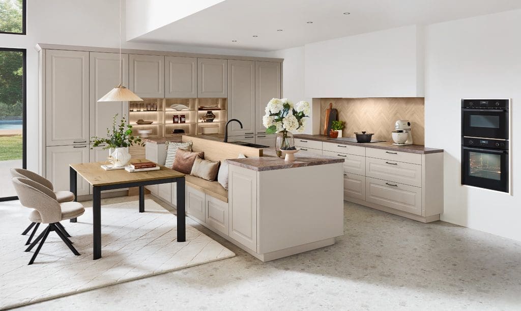
1. Classic Neutral Kitchen Tones
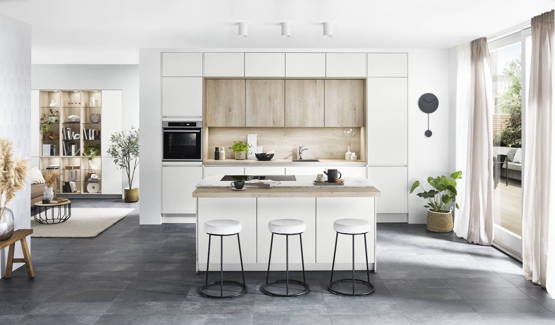
Neutral tones continue to be a favourite in UK kitchens because of their versatility and ease of coordination. They serve as a timeless base that works with almost any design style — from traditional Shaker kitchens to contemporary matt finishes.
Common neutral options include:
- Whites & off-whites — brighten the space and make smaller kitchens feel larger
- Soft greys and greiges — contemporary yet warm
- Beige, cashmere, taupe and putty tones — create a cosy, inviting atmosphere
Neutrals also pair beautifully with natural materials like wood and stone, adding depth and texture to your scheme.
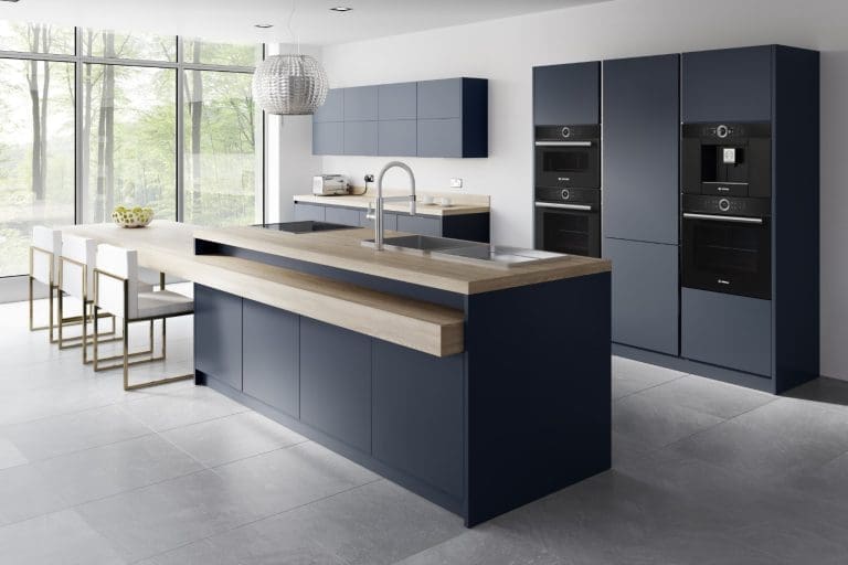
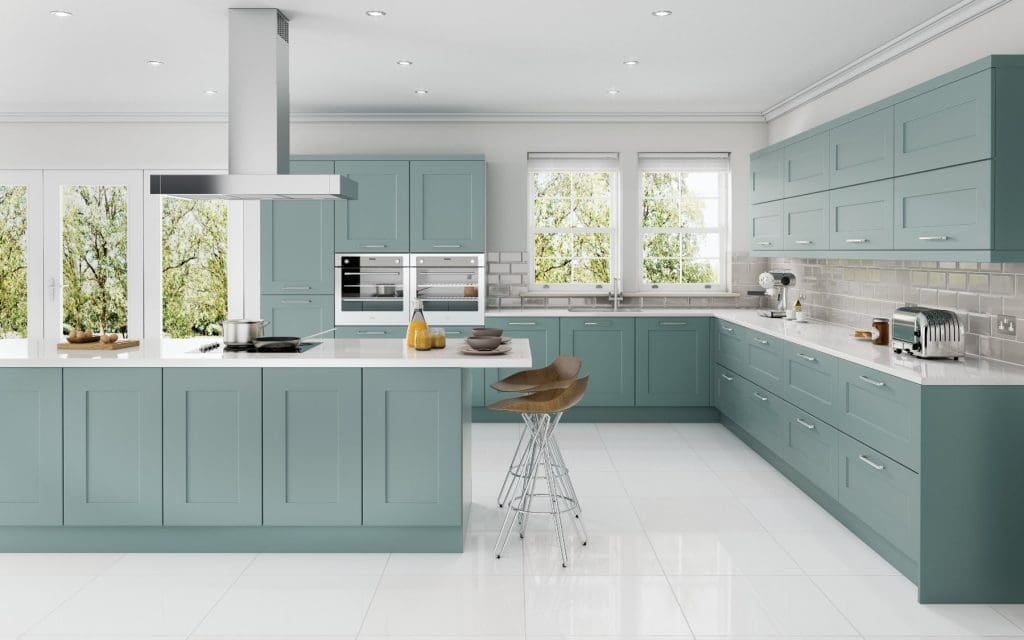
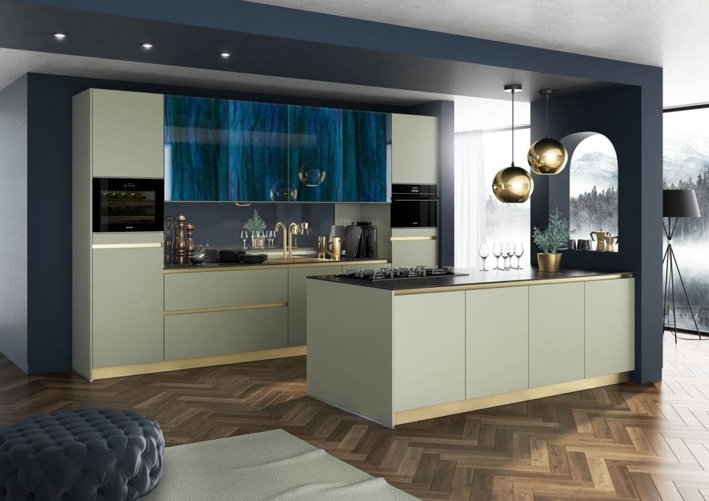
2. Bold and Vibrant Kitchen Colours
Bold colours add personality and energy to a kitchen, especially when balanced with more subtle tones. Popular choices that are increasingly embraced include:
- Navy blue — sophisticated and dramatic
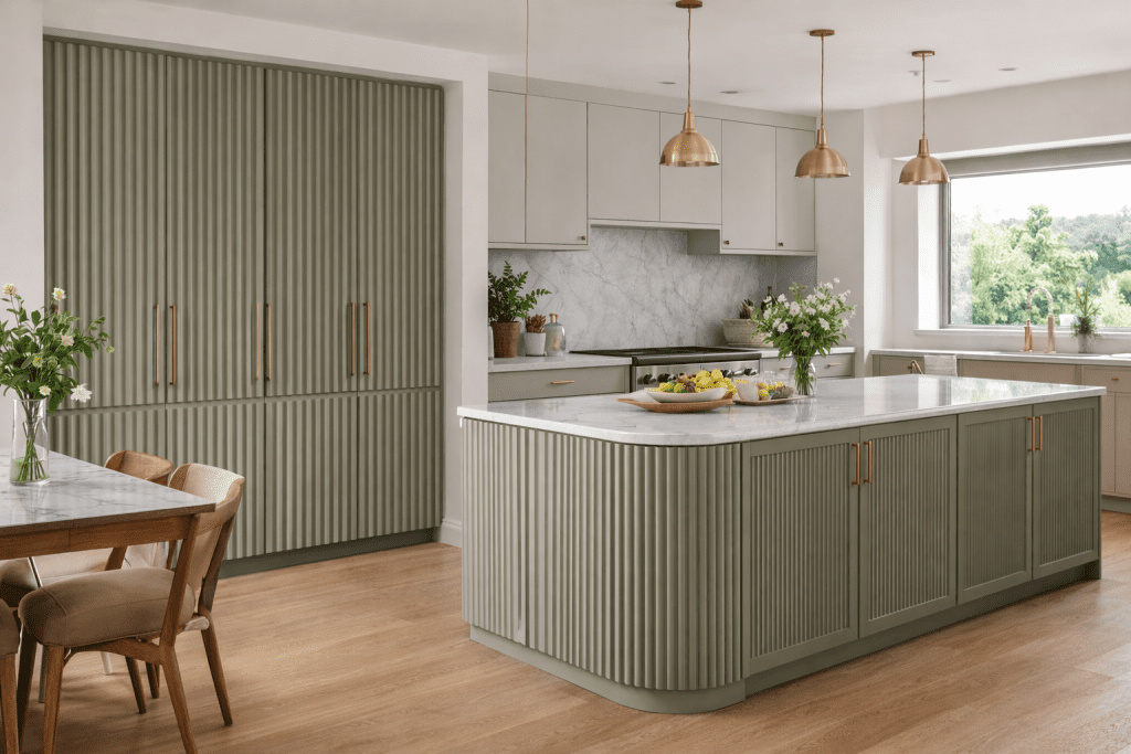
- Forest green — brings nature indoors
- Mustard yellow — warm and uplifting
These colours work well on cabinetry or islands and can be balanced with lighter walls and worktops.
Recent kitchen design trends also suggest homeowners are using colour to express personal style rather than just follow convention, embracing palettes that reflect mood and individuality.
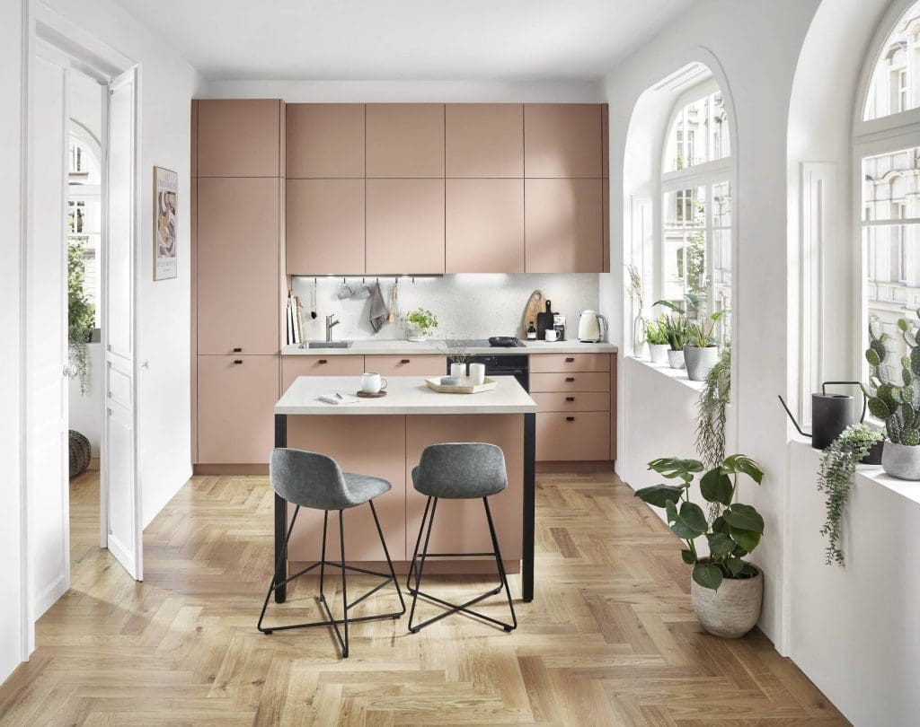
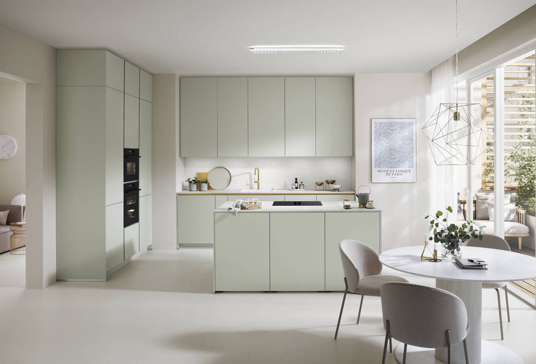
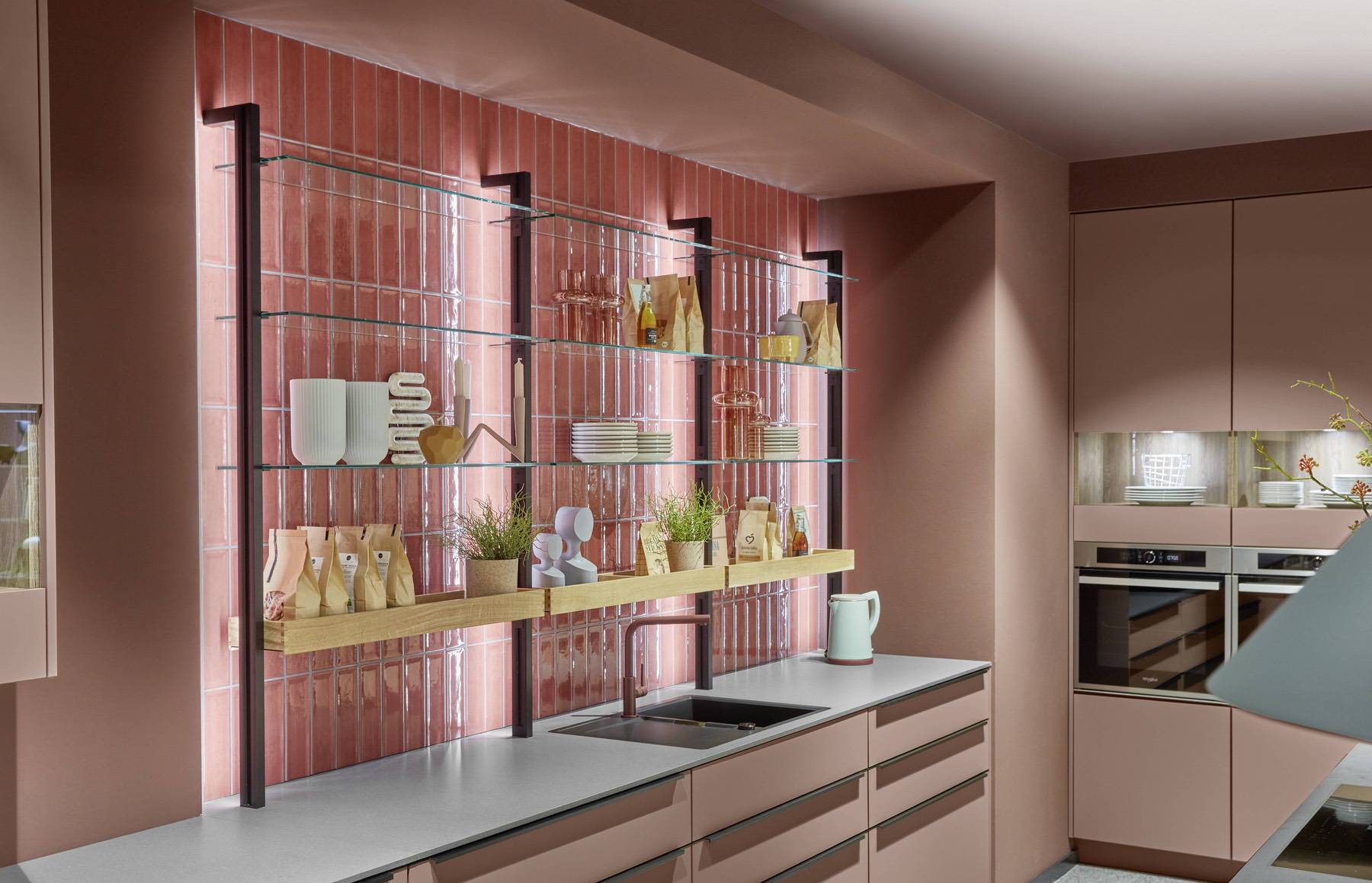
3. Soft Pastel Kitchen Tones
Pastels offer a fresh, light and soothing feel — particularly useful in smaller or darker kitchens. Popular pastel tones include:
- Mint green — refreshing yet subtle
- Blush pink — warm and gentle
- Sky blue — airy and calm
These shades comfortably complement both neutral and natural finishes, lending a contemporary and stylish mood without overwhelming the room.
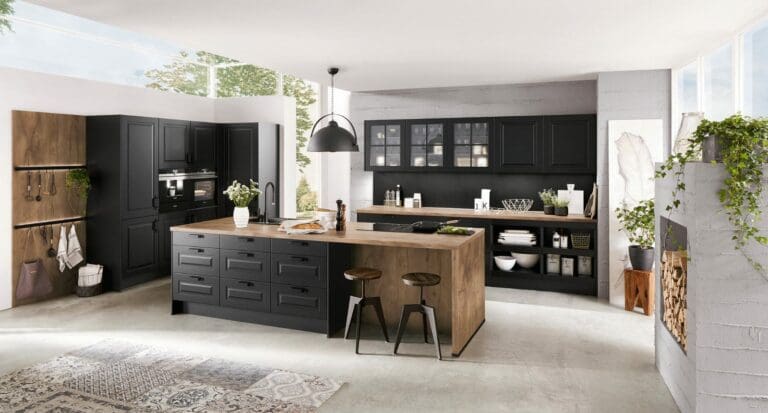
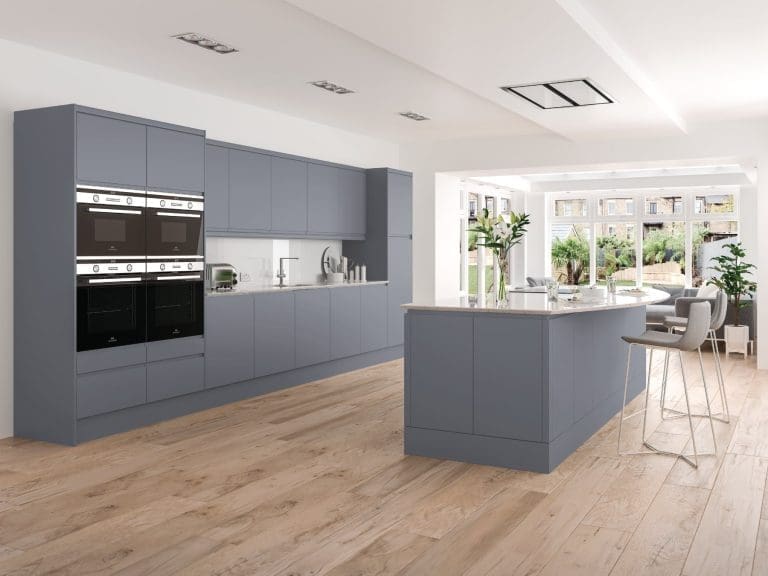
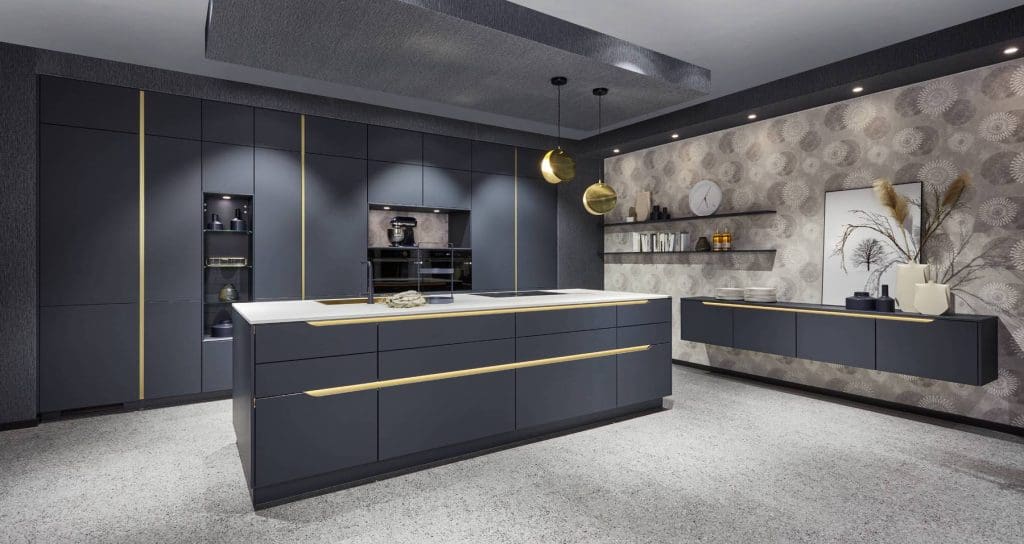
4. Monochrome Kitchen Designs
Monochrome schemes use varying tones of a single colour to create a cohesive, layered look:
- Black & white — a timeless classic
- Shades of grey — sleek and modern
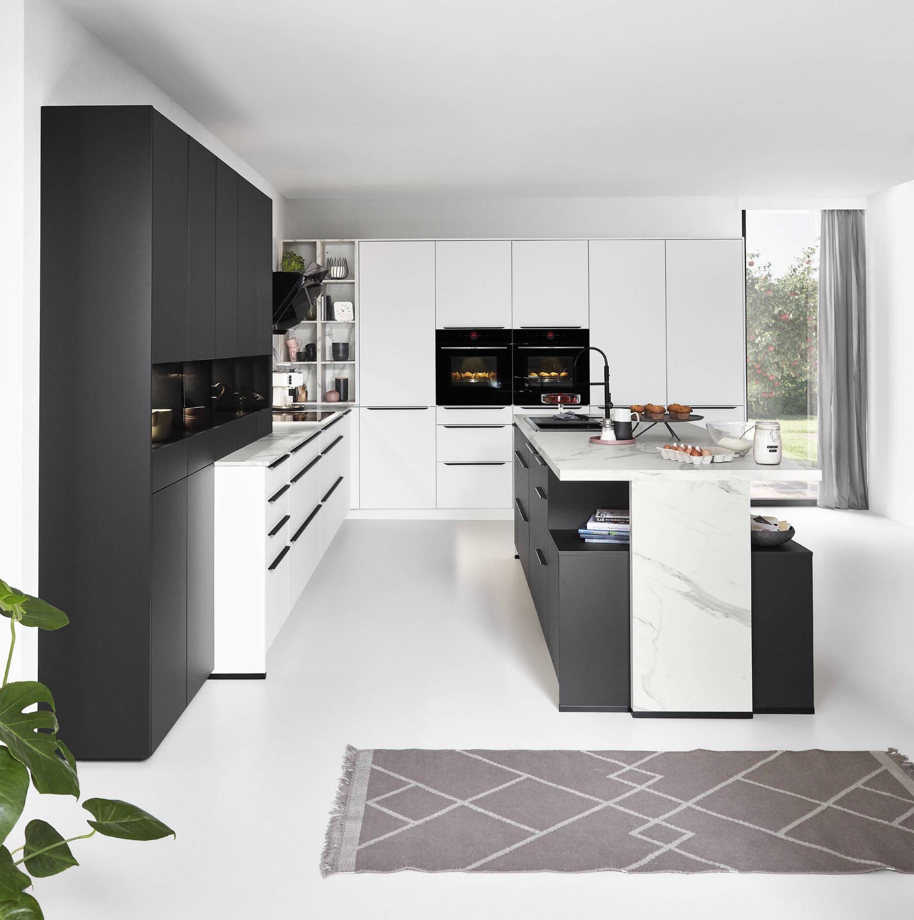
Monochrome designs often rely on texture and contrast (e.g., matte cabinets with glossy tiles or wood accents) to keep the space interesting.
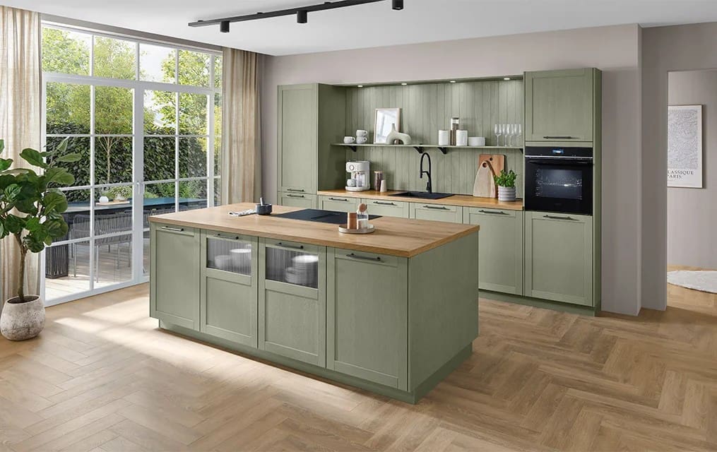
Kitchen Colour Trends
Kitchen colour trends are evolving beyond stark whites and cool greys. Designers and homeowners are favouring:
- Warm neutrals like creamy taupe and plaster-inspired hues
- Rich, nature-inspired colours such as clay, olive and forest green
- Soulful warms like buttery yellow or terracotta tones
- Mood-enhancing colours that evoke comfort and personality
These trends reflect a broader shift toward kitchens that feel welcoming, expressive and enduring, rather than fleetingly fashionable.
The Rise of Confident Colour in Modern Kitchens
While white and neutral kitchens remain timeless, many homeowners are now embracing more confident colour choices.
Rather than relying purely on safe tones, today’s kitchens often incorporate colour intentionally — either as a defining feature or as a carefully placed accent.
This shift reflects a broader desire for individuality. Kitchens are no longer purely functional spaces; they are central to how people live, entertain and connect within the home.
Accent Colour or Full-Colour Cabinetry?
When introducing colour into a kitchen, one of the most important decisions is scale.
Using Colour as an Accent
Accent colour allows you to introduce personality without overwhelming the space. This might include:
- A statement island
- A single bank of tall units
- Coloured base cabinets paired with neutral uppers
- Feature splashbacks
Accent approaches work particularly well in open-plan homes, where the kitchen must connect visually with living and dining areas.
Choosing a Fully Coloured Kitchen
A fully coloured kitchen creates a more immersive look. When cabinetry throughout the room carries a consistent tone, the effect can feel bold yet cohesive — provided it is carefully balanced with lighting, flooring and worktop materials.
Full-colour kitchens require greater consideration of undertones and finish, but when executed well, they feel distinctive and confident rather than trend-led.

How Colour Influences Mood
Colour has a subtle psychological impact on how a space feels.
While personal taste should always lead the decision, certain tones are commonly associated with particular moods:
- Blue tones tend to feel calm and composed.
- Green hues feel balanced and natural.
- Yellow and warmer shades introduce warmth and energy.
- Deep reds or burgundy tones create drama and intensity when used sparingly.
Rather than selecting a colour purely for visual appeal, consider how you want your kitchen to feel during everyday life — relaxed, energised, sociable or serene.
Choosing the Right Colour Scheme for Your Space
When planning your kitchen colours, it’s important to consider practical factors as well as style.
1. Light and Space
- Small kitchens benefit from lighter colours that reflect light and make the area feel open.
- Larger spaces can accommodate darker or more saturated colours without feeling enclosed.
2. Natural Light
Consider how much natural light your kitchen receives. Colours can appear warmer or cooler depending on lighting, so test samples at different times of day before committing.
3. Mood and Function
Colours influence mood:
- Blue: calm and serene
- Yellow: cheerful and energetic
- Green: balanced and refreshing
Consider how you want to feel in the kitchen as well as how it looks.
4. Balance and Contrast
Using the 60-30-10 rule — dominant colour (60%), secondary colour (30%) and accent colour (10%) — can help create a balanced scheme with visual interest.
Practical Tips for Harmonious Colour Combinations
- Pair bold cabinetry with neutral walls to avoid overwhelming the space.
- Use wood, stone and metal accents to add texture and warmth.
- Test swatches in your kitchen before finalising (lighting and neighbouring finishes change how colour reads).
- Consider colour psychology — warmer hues can make a kitchen feel inviting, while cooler tones can be calming.
Not sure which colours will work best in your space? Seeing finishes and colour combinations in person can make all the difference.
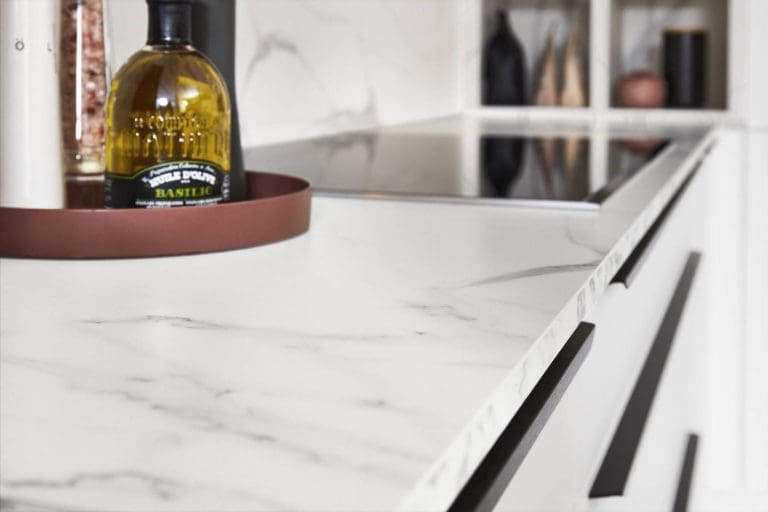
Kitchen Finishes Explained: Matt, Gloss and Textured Surfaces
Colour is only part of the decision. The finish you choose will change how that colour behaves in your space.
Two kitchens in the same shade can feel completely different depending on whether the cabinetry is matt, gloss or textured.
Understanding this difference is essential before finalising your palette.
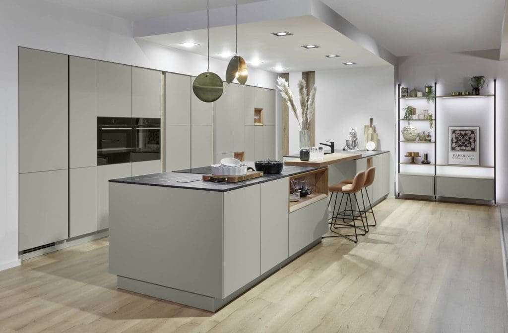
Matt Kitchen Finishes
Matt kitchen finishes absorb light rather than reflect it. This creates a softer, more muted appearance.
They are often chosen because they:
- Feel contemporary and understated
- Reduce glare in bright spaces
- Offer a smooth, modern aesthetic
- Pair beautifully with wood and stone
Matt finishes work particularly well in open-plan kitchens where you want the cabinetry to feel calm rather than reflective. Darker matt tones can create depth, but they should be balanced carefully in rooms with limited natural light.
Maintenance-wise, modern matt finishes are far more durable than older generations, but very flat surfaces can show grease marks in high-use areas if not wiped regularly.
Gloss Kitchen Finishes
Gloss finishes reflect light, which can make a kitchen feel brighter and more dynamic.
They are often used to:
- Increase perceived brightness in smaller kitchens
- Add a sleek, contemporary edge
- Enhance clean architectural lines
Because gloss reflects both light and surroundings, it can amplify contrast in high-contrast colour schemes.
However, darker gloss cabinetry may show fingerprints more readily. Lighter gloss tones tend to be more forgiving in everyday use.
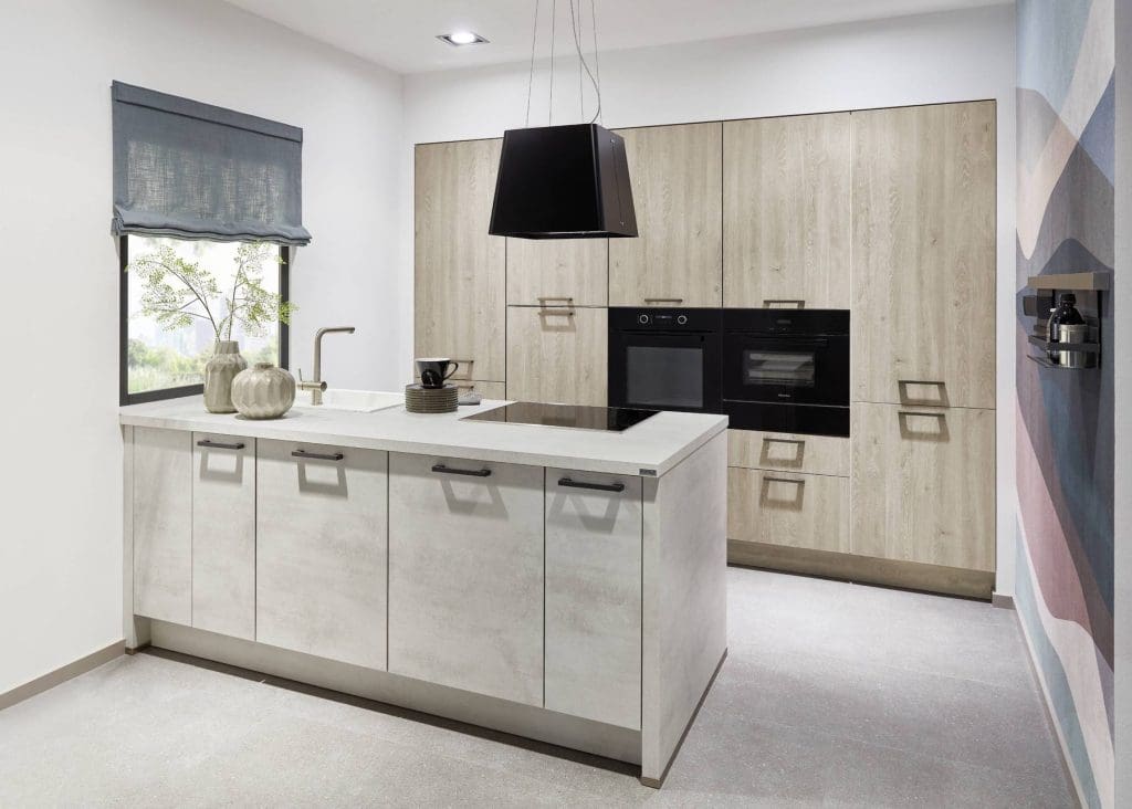
Textured and Wood-Effect Finishes
Textured finishes introduce depth and warmth into a scheme.
These may include:
- Wood-grain laminates
- Subtle surface textures
- Ribbed or fluted detailing
- Concrete or stone-effect cabinetry
Texture is particularly effective in neutral kitchens, preventing them from feeling flat or clinical.
In modern UK kitchens, textured finishes are increasingly used to soften minimal designs and introduce visual interest without relying on bold colour. When selecting a finish, consider not just how it looks in a showroom — but how it interacts with your lighting, flooring and worktops at home.
How Light Affects Kitchen Colour
Lighting dramatically changes how colour appears.
A shade that looks warm and inviting in a showroom can appear cooler or flatter once installed at home. This is particularly important in the UK, where natural light levels vary widely.
North-Facing Kitchens
North-facing rooms receive cooler, softer light. In these spaces:
- Warm whites feel more inviting than cool whites
- Greys can appear bluer
- Deep tones may feel heavier
Warmer undertones often help balance the cooler daylight.
South-Facing Kitchens
South-facing kitchens receive stronger, warmer light. Here:
- Cool-toned greys may feel balanced
- Darker colours can feel dramatic without becoming oppressive
- Light colours appear brighter and crisper
Artificial Lighting
Evening lighting plays a huge role in how your kitchen feels.
Warm LED lighting softens colours and adds warmth.
Cool LED lighting enhances crispness but can flatten warmer tones.
Before committing to a cabinet colour, test samples in your own kitchen at different times of day. Place them vertically (as cabinetry would sit), not flat on a worktop.
This small step prevents costly regret later.
Choosing a Kitchen Colour That Will Age Well
A kitchen is a long-term investment. While trends are useful for inspiration, your cabinetry may remain in place for 10–20 years.
To create a scheme that feels current without becoming dated:
- Choose a neutral or balanced base colour
- Introduce bolder tones through islands or accents
- Avoid overly trend-led shades unless you genuinely love them
- Consider how flooring and adjacent rooms connect visually
Timeless kitchens are not plain. They are cohesive.
If resale value is a consideration, neutral foundations tend to appeal to a broader audience. That doesn’t mean avoiding personality — simply placing it thoughtfully.
Common Kitchen Colour Mistakes to Avoid
Even well-planned kitchens can fall short if colour decisions are rushed.
Here are common pitfalls to avoid:
1. Choosing Paint Before Cabinetry
Cabinet finishes should lead the decision. Wall paint is easier to adjust than cabinetry.
2. Ignoring Undertones
Mixing cool and warm undertones unintentionally can create subtle visual tension.
3. Overcomplicating the Palette
Too many competing tones can make a kitchen feel busy rather than cohesive.
4. Skipping Sample Testing
Always test cabinet samples in your own lighting conditions before committing.
5. Following Trends Without Context
A colour trend that looks stunning online may not suit your layout, lighting or lifestyle.
Taking time at the planning stage helps avoid expensive changes later.
Bringing It All Together
The most successful kitchen colour schemes balance tone, finish, light and material.
Instead of focusing on one element in isolation, consider how each component works as part of a whole:
- Cabinet colour
- Surface finish
- Worktop material
- Lighting temperature
- Flooring tone
- Hardware finish
When these elements align, the result feels effortless — even if significant thought has gone into the planning. If you’re unsure how colours will interact in your space, working with an experienced kitchen specialist can help refine options before final decisions are made.
Kitchen Colour Schemes: FAQ’s
Which kitchen colour scheme is best for small kitchens?
Lighter colours such as cream, pale grey or soft pastels help reflect light and make smaller spaces appear larger and more open.
Are bold kitchen colours still on trend?
Yes — bold and expressive colours continue to be popular, especially when paired with neutral tones and natural materials.
Should I match my colour scheme to my cabinets or walls first?
Start with cabinets or large fixed elements, then build secondary and accent colours around them for cohesion.
How does colour affect the perceived size of a kitchen?
Light, reflective colours help make a space feel larger, while darker shades can make it feel more intimate and cosy.
Can I use more than one bold colour in my kitchen?
Yes — but balance is key. Combining two bold complementary colours with neutrals can create a dynamic yet harmonious palette.
Is it better to follow colour trends or choose timeless shades
Trends are useful for inspiration, but classic neutrals and nature-inspired hues tend to age better, particularly in busy kitchens.
Final Thoughts
Your kitchen’s colour scheme is far more than decoration — it sets the tone for how the space feels, functions and ages over time. By combining thoughtful design principles with current insights and experimenting with swatches in your own space, you can create a kitchen that’s both stylish and genuinely enjoyable to live with.
For help in planning your perfect kitchen colour scheme, talk to your local Kitchen Specialists today!